
 Old School Tool
I find that using custom-made rubber stamps is a lot of fun for making hand-stamped stoneware tiles. It has an element of instant gratification (comparably) and in a studio life dominated by highly-detailed, intricate pieces, these rubber stamps are refreshing from a creative standpoint. They also force me to think in completely different terms, in abstract, in which composition and design theory are essential for concocting a stylish design that will translate well when stamped and, just as importantly, when glazed. I can instill a visual narrative with relative ease, as well, allowing me to integrate additional motifs that I cannot with my realistic sculptures.
But this isn't to say the process is easy! It never ceases to surprise me just how difficult it can be to achieve an effective composition, and how many permutations are explored before settling into one. The unexpected always pops up, too, taking the creative idea into completely different directions. And the thing is -- if you don't stay open to those new directions, more likely you're going to miss a better concept.
So I thought it would be fun to share the process of creating a new tile stamp, in this case, Fire & Ice, a design depicting a fanciful Arabian mare and stallion in a kind of dance of attraction. Now I know I have to get back to that glazed Taboo I posted earlier, but when I'm not sculpting, my brain (perhaps too easily) jumps into other ideas. And I've learned through the years that when the inspiration hits, fly with it! So...onward...
My stamped tiles actually start as ideas that end up as doodles. My office and studio are littered with bits of paper with these quick sketches on them. If one really strikes me, I print out a pre-sized tile "template" I made in Photoshop in a shape I think will work best with it. I've made templates for all my tile-cutters, against a grey background. Then I redo the doodle in there. So here is the original Fire & Ice concept (below), a stallion with a fire motif (left) and a mare with an ice motif (right):
 The little circles at the top are roughed out holes from which this 3" tile will hang. However, it's important that the design work without that hole there, too, in case I want to inset some into trivets or frames. The adaptability of these tile designs is really important to maximize their application.
 After that first step, they went through several refinements and tweaks, but still...something just wasn't jellin':
 The original "almost there" drawings done with a dime store pencil and typewriter paper. We're low-end here.
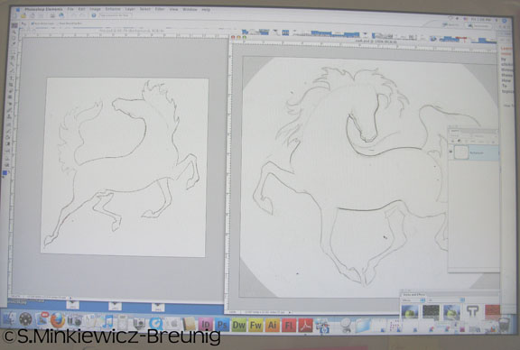 You can see I've scanned my drawings into the computer and opened up the image-editing program, Photoshop Elements. I use that program (or full Photoshop) to play around with the designs and composition. The program allows me to tweak everything instantly without having to do endless rehashes on paper. Seeing the designs on a computer screen also helps me to separate my eye from them, letting me to see things that need fixin' that I couldn't really "see" on paper.
 So as I got to tweakin', I regarded their head positions and realized, "Hey, why not combine them?" This is easy to do in Photoshop with a simple copy/paste and...voila. On the left is the original combo, which I then printed out, and used that print out to do further refinements, such as new tails and switched hind legs on the mare, which were rescanned into the program (right).
 I thought they were too close, cramming the design, so I opened up a new circle window and copy/pasted each one into the new circle (peeking out on the right). However, I decided to bump up the size of the tile from a 3" circle to a 4" circle since two of them are on there now. I also decided to resize the new circle window to twice the size of the intended clay-cutter, from 4.25" to 8.50", because it's better to work big then shrink down since doing so sharpens lines. Also, rubber stamp designs need to be submitted in the exact size, but in 600 dpi, so I want things to be as crisp as possible. Now while it's easy to get carried away with exactitude, I have to remember that the actual stamping process will cause some distortion. The clay, the process, and the glaze all create their own magic, making each tile a true one-of-a-kind. So no amount of control and precision in the design is going to translate perfectly into the finished tile. But that's the fun of it!
 Then I use the eraser tool (red arrow) to remove the excess around the newly pasted image. Now I'm left with two independent images, the mare and stallion, that I can manipulate separately.
 I have to resize both of them to use up more space within the circle. You can see me do that here, with the stallion. When you want to maintain the scale as you resize, simply hold down the "shift" button and drag the frame squares.
 Another great use of the cut/paste option is that you can select individual body parts and copy/paste them. Then you can rotate or resize them as you need to get things just right. Here you see me lengthening the mare's body just a hair and rotating it a bit, which would have been tedious on paper. With Photoshop, it takes two seconds. You also can use the line tool to compare body parts for symmetry, like leg bones. So doing that, I had to make some minor adjustments in the length of each horse's cannon bones. Easy-peasy in Photoshop!
 With the cut/paste option, you can see me tweaking the mare's outstretched hind leg by opening up her hock angle.
 OK, so they're about how I want them -- not perfect, but about there. The black dot at the top is the anticipated hole that will hang this tile, so I have to be sure my design works with that, too. I also had to erase their tails (in the program) because this new design made their original tail designs infeasible. So I print this out and take it back to the table for some low-tech tweaking with an eraser and pencil.
 So here they are after the pencil work and new tails, and rescanned into the program. While I like the design, their proportions are a bit too pony-like. They look more like Welsh ponies rather than Arabian horses, so I have to change some of the proportions. Again, I can do this in the program by selecting an area, and then copy/pasting and resizing. So I shrink both their heads and lengthen their legs (which I forgot to photograph in my haste).
 So I print that out, do some small tweaks with a pencil, and then use a good ol' dime store felt-tip black marker to ink-in the lines. I should learn how to use a vector program, I know, but I'm still married to my felt tips. One thing I did learn: Ink outside the lines! If I don't, my design ends up "skinny-fied," which can make some areas too delicate for stamping.
 Here's the inked version scanned into the program (left) next to the pre-inked version (right). The inking gives me solid black lines for me to use the select tool for copy/pasting.
 So I've opened up a new circle window and filled it with black. Then I used the magic select tool to select the mare inside the inked lines, and pasted her onto the new black circle. I have to select her extended hind leg separately since anything not connected to the body won't be selected along with it. I have to do the same to the stallion and his two separated legs. While it would seem a bother to select the legs separately, it's actually a boon because then I can play with their placement separately, too. In this case, I decided to set the mare's extended hind leg a hair higher than in the drawing because it "opens up" her motion more.
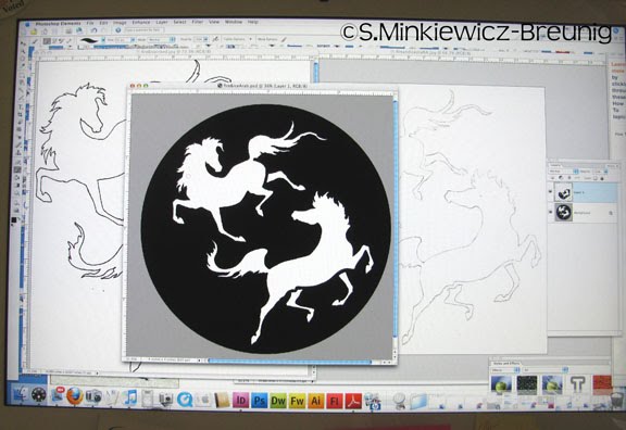 Here's where I am now: Two white horses on a black background. I do some adjustments and clean up with the paint brush tool. Now I'm going to sleep on this because the mare's head is bugging me. Anyway, areas that are white will be raised up when stamped while anything black will be depressed when stamped. In other words, black = pooled glaze. The whole trick to getting a stamped tile right is having both the positive space (white) and the negative space (black) both stamp-able and interesting, but also glaze-friendly.
I like how this design has come out, and it's taken me all day to get this far. But I firmly believe these stamp designs work best when I rush them because that captures the initial energy of the inspiration and design. So easily these abstracted drawings can become overworked and lose all the spark they once had. So I give myself a maximum of 48 hours to complete one, start to finish. Otherwise -- into the bin. No exceptions.
But I won't "flatten" the layers just yet in case I want to tweak the design tomorrow. I always leave room for a fresh eye. Because I also know it's time for the really hard part: Putting the fire and ice motifs in there. I have to do this in a way that makes sense, is stylized enough to jive with the style of the horses, yet will stamp well. But above all, it cannot make the stallion look like he's on fire or the mare look like she's being pelted by snowflakes. It's always the little things that are the hardest! So tomorrow, (fingers crossed), I'll have finished this design just the way I want it within the 48 hour limit, or into de trash it goes! Stay tuned!
"You can't plan for a seizure of feeling, and for this reason I put everything else aside when I'm inspired." ~ May Sarton


