
Every year, I join my buds Stephani R., Kay M., and Laurie J. for a weekend of wine tasting and general silliness. It started as my bachelorette
party in 2000, in Sonoma, and we had such a great time, we decided to make it a unmitigable
Law of Nature. In fact, it's widely theorized that existence can only take all four of us together for no more than 72 hours, otherwise we create a singularity of lunacy that threatens the very fabric of space-time. I always have a blast, but what was super-special about this year was that it was our 10 year Anniversary of this insanity! Again -- time flies!
We all flew into LAX, and met at the
Encounter restaurant, that famous UFO-looking building smack dab in the middle of the circus. I swear -- it's like they designed a restaurant
just for us! If Dr. Seuss and The B-52s were in the restaurant business, the inevitability would be this place...but perhaps with goldfish tanks and beehive hairdos. But I firmly believe all restaurants require lava lamps now. The elevator ride up was entertainment in itself! We got a window seat and had a panoramic view of the airport, and we could even see the biggest passenger plane in the world -- the
Qantas Airbus A380!
 Coming up the back way, from Terminal 3. I got lost and ended up in the employee cafe downstairs...with my giant suitcase. Everyone stared. A very nice man directed me to the proper entrance. I couldn't get over how nice the airport employees were. This was LAX?

An interior shot. I love architecture that isn't based on straight lines, so it was right up my alley. If money was no object, I'd design a house with no straight lines allowed, with windows, murals, tiles, mosaics and art glass installed everywhere. After lunch here (and more than my fair share of "Tidy Bowl" blue margaritas), we set off for wine country!
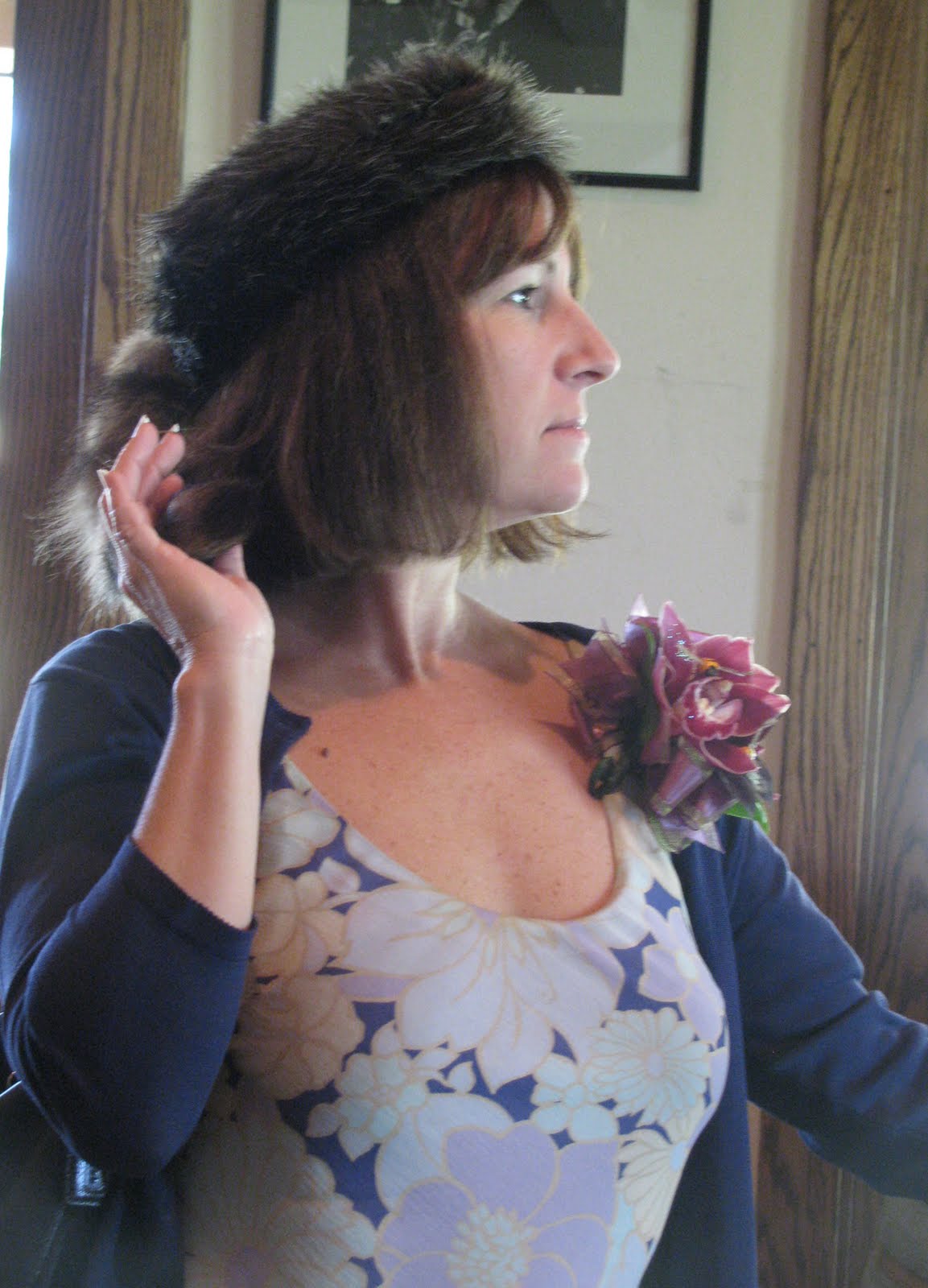
 Laurie's multi-talented daughter, Merryl, made each of us a gorgeous corsage for the weekend. Each of them had different colors and critters, and so beautifully made! Mine here, had greens and a cute beady-eyed birdie. Steph had a butterfly, Kay had bees (cuz she's The Queen Bee) and Laurie had a dragon fly. I was so touched by this thoughtful gesture -- THANK YOU MERRYL! I managed to get mine home and I'm trying to dry it so it can live in my studio forever.
The weather was amazing -- in the 70s, no wind and gorgeous blue skies with big puffy clouds. The hills were verdant green, and with the diverse foliage, they created almost abstract-like "paintings," and I couldn't resist indulging in some photos. I swear...if you were a landscape painter, it was a cornucopia of inspiration! Now keep in mind these photos aren't adjusted for color saturation...they really looked like this!...


 There were quite a few rose bushes or poppies planted at the end of the grape vine rows. I was told that troublesome bugs go for those flowers first, and leave the grape vines alone. Clever and green!
 So flowers were bloomin' everywhere, and I couldn't resist snapping pix of a couple.

We went to quite a few wineries, but my favorite by far was
Melville. I loved every single wine we tasted there (which is rare), even the whites (which is very unusual since I'm a red wine gal). Now my favorite wine of all time is
Matanzas Creek's Sangiovese (which they no longer make --
of course!), but the reds from Melville were very close seconds. I bought a bottle of their famous
Voignier for Mom as a Mother's Day gift (hope you like it, Mom!).
 Melville Winery, with Kay, Laurie and Steph in the lower right. Our wine tasting guru in the tasting room, Lynn, was a total riot. So much of the wine tasting experience is getting someone witty and fun behind the counter, and we lucked out here at Melville.
 Rosemary grows everywhere in wine country as a landscaping accent and Steph, a rosemary junkie, laments she cannot grow it in her yard, living in New York state. So she takes every opportunity to immerse her senses in it, like one of those drinking bird novelty items, as you see here. Enjoy Steph!
 We had dinner at The Chase for some old school Italian. I had an amazing halibut with capers and steamed veggies, and the antipasto bean dish was delicious, too -- firm, tiny tan beans bursting with flavor. We had a wonderful meal, watched over by ol' Frank.
 My personal highlight -- other than Melville -- was Saarloos & Sons Winery which pairs its wine with their gourmet cupcakes! Cupcakes! You have to eat a specific cupcake with a specific wine since the little baked delight actually is made with that wine. Now while all this may sound gross -- trust me -- it isn't. It's wonderful! It really works! I've decided that (1) cupcakes make a perfect pairing with wine and (2) cupcakes taste better when made with wine. Seriously. No. Seriously.
  And what was even more interesting at Saarloos was this full shower in their public restroom! What the heck?! We found out later that the tasting room used to be a spa, but it was much more fun not to know and guess why a winery would need a shower in its restroom: Outrageous barrel-tasting parties! Woot!
 Laurie brought along these funny quotes lifted from actual wine reviews and full of innuendo. Predictably, we milked them dry...dryer than the driest Chardonnay.
 Ham, this one is for you!
 I actually had to look up what "treacle" was. Apparently, it also is a long-standing joke in Britain. Who knew?
 No comment.
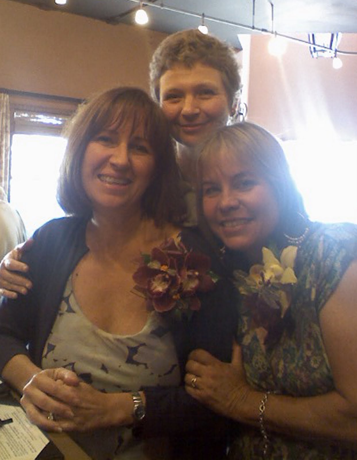
 Laurie, Steph and Kay, with their corsages a-bloom! Thank you Merryl!
 Kay looking noble and regal -- as always -- at Fess Parker, which is where we started our adventure (below). If you don't know, Fess Parker was the actor who played Daniel Boone all those years for Disney...hence the raccoon hat. Or maybe I should have just left you in the dark about that and let you always wonder why...
 Laurie is notorious for bringing along all manner of questionable distractions, two of the most notable this year being her pigeon puppet (made for her by someone in her pest control biz) and a tiny accordion. Yes. An accordion. Laurie with an accordion. At her most passionate moments of playing, Kay's bellow, "SHUT UP!" could be heard to ring out, like a demented Pavlov dog experiment.

 Do you recognize the squid? And for some reason, Laurie brought along "pirate hair," which Kay -- naturally -- immediately put on.
 Kay, Steph and Laurie -- I love this pic!
I made it to my plane with ten minutes to spare, and had an uneventful flight back -- just the way I like 'em. I'm still digesting the knowledge that it's been ten years. A decade. I remember when a day would creep on for eons as a child, now a day is over it what seems like one breath. One thing is clear: As we age, we not only get wiser, we get sillier, too, and amen to that! Thank you gals for another fantastic weekend!
"Wit is educated insolence." ~ Aristotle

Friends Wit Wine

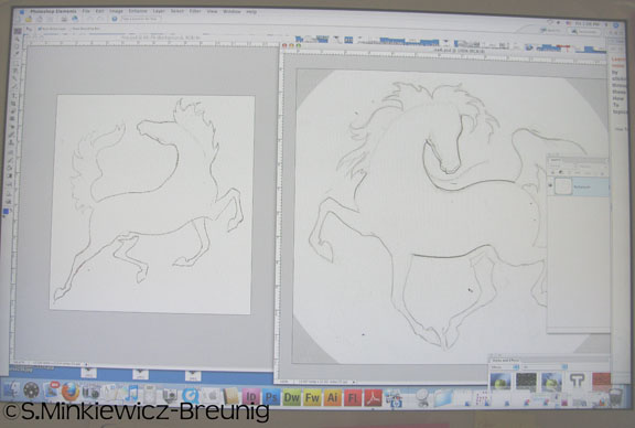
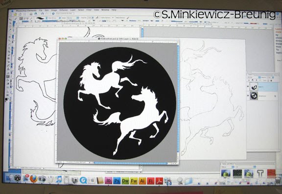
 Sneak peek at the new 3" tile designs.


