Showing posts with label medallion. Show all posts

Monday, October 10, 2011

Trouble Comes in Pairs


Shavings ruled the day with the "Suncorn." Lots of 'em.

This past weekend, I dove into that project I mentioned in a previous post - a pair of unicorn plaques with a sun/moon motif. You'll find that motif pop up in my giftware quite a bit because I'm attracted to the the idea of paired opposites. Of one not being able to exist without the other. Yin and yang - that sorta thing.

Anyway, this was my first expedition into sculpting pairs, and I thought it would be a cinch. No biggie. No big whoop. 

But it turned out to be a project that involved far more royal-PITA work than I ever imagined, and all because they were paired. I didn't realize it at the time, but being a pair presents challenges not found elsewhere in sculpture, and which tend to complicate the cogs of creativity in truly maddening ways.

OK, here's the moon version roughed out, in the middle of the process (left) and at the end (right). Took a day - easy as pie. Now I had to sculpt its partner, the sun version. Here's where things get stickier than bubblegum on a hot sidewalk.

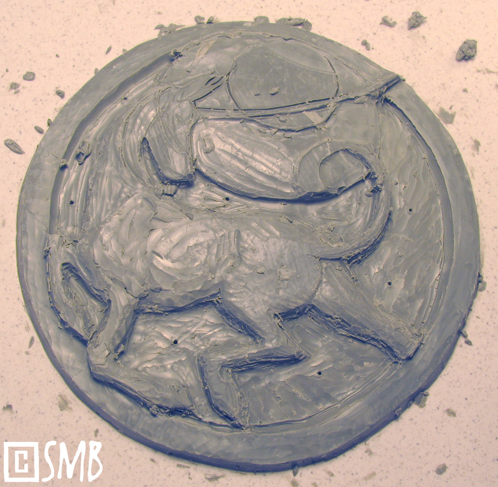
The encouraging, pristine block of cut-out clay for the sun plaque. It seems to be smiling at me, benign and enticing. Oh, how it lies!
 
Using a pair of locking calipers, I measured the side rim of the moon plaque and locked it, then used that to calibrate the thickness of the sun plaque by punching "measuring holes" along the rim. Being a pair, both had to be the same thickness. Seemed simple enough, but - wow - did it prove to be more annoying than I anticipated.

So here's the blank being shaved down. I start along the rim first, using the ridged side of a "squared" sculpting tool. However, I don't pare down directly to the measurement, leaving a little bit extra for wiggle room.

For the middle, I used the half-round because it rips off more clay faster.

 
Once all that's done, I laid a printout of my sketch on top of it. Using a stylus (any kind will do, even a dull pencil works well), I trace along the lines, pressing firmly. All my bas-relief pieces start from simple line drawings this way.

Traced in. Now I could have pared the block down completely and added clay "inside the lines" to build up the "outy" features - and in hindsight that perhaps would have been the better strategy. But squishing on sticky oil clay too much can make my finger tips sore, even blister them, so I often opt to pare down rather than build up.

Starting to cut out the design.
I used an old airbrush needle to poke holes at certain points in the moon plaque, and used a Sharpie to mark the needle for depth. I swear, I could write a book on the 1,001 uses for old airbrush needles.

 I then poke that needle into the sun plaque to compare depths, and add or pare down accordingly. This process takes a surprisingly long time.

  
 Here I am rechecking. You have to recheck constantly because it's easy to veer off-track without even knowing it. As for the outer border, I really liked the flat-side of the squared off tool for evening it out.

So I get almost done with the sculpting the unicorn, but I somehow got off-track and made him way too thick. It happens. I remeasured with the needle and ended up having to pare him down almost completely, erasing all those hours of work. Argh! But it's important not to get too married to anything in sculpture, because if it's gotta go, it's gotta go. And well, those front legs are looking weird to me, too. Hmmm.

To complicate the deal, they not only have to match in terms of thickness, but also in dimension. BAH! Comparing things side-by-side works, but well...our human eyes just aren't that precise. I used my calipers and developed suspicions, but I wanted to be absolutely sure, mostly as a means to train myself. The more hardcore I was in this, the more my Eye would have to learn. So I took a picture of both plaques and loaded them into Photoshop for direct comparison. Here I've used the paintbrush tool to trace along the lines of the moon plaque in black (in a new layer so I could copy it and overlay it onto the sun plaque).

But it doesn't end there! No siree. Along with all the matchy fiddly work, I also had to stay true to the original design. All these constraints! Ack! I want to pull my brain out! So I loaded the original design into Photoshop and traced along the design with the paintbrush tool in white (also in a new layer).

Through a series of Photoshop comparisons, between the two unicorns and between the sun plaque and the original drawing, I could objectively discern where I went wrong and decide where to make adjustments. Interestingly, the dimensions between the two unicorns was very close, but I was way off compared to the original drawing. This was why the front legs looked so odd to me. (Here the colors were switched, white being the moon unicorn and black being the sun unicorn.)

What's handy about having a sized drawing to work from is using it as a template for shaping clay. Here I'm using snakes of clay to outline the flow of the tail.

Here are some of the tools I used. I love the loop tools for clay, with "U-turn," round and square tip shapes. But I also use that curved blade a lot, especially for carving edges or cutting in eyes and mouths. That longest one is my standard sculpting tool for all media. Its simple shape is deceptive - I find it a perfect sculpting tool for practically everything! 

Another challenge I encountered with this project was "handed-ness." Unless we're ambidextrous, each of us are "handed," either left or right handed. Well, the same applies to sculpting - we usually have an "easier" side sculpting, especially when it comes to detailed bits like the head. This is why you sometimes hear a sculptor imply one side was easier to sculpt than another. In this case, I had to sculpt essentially the same unicorn, but flipped over, as each plaque had reversed unicorn designs. This definitely proved to be interesting.

It's easier to get around this glitch in a 3D sculpture because we can move it around to gain better access with our tools. Not so with a flat bas-relief. The backing tile totally gets in the way and so our handedness is shoved in our faces rather shamelessly. Indeed, sculpting that sun unicorn's head and mane became a real chore. Interesting.

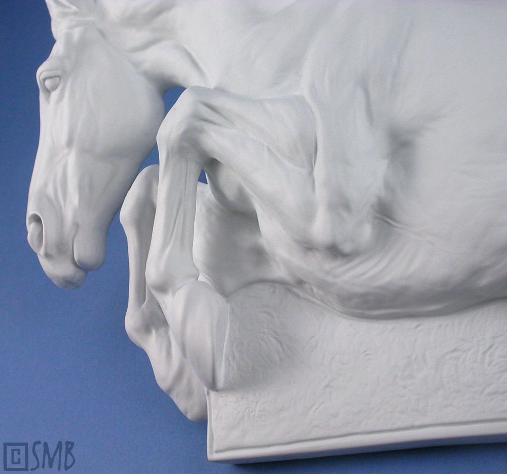
Anyway, after much trial and tribulation, I finally finished the pair. They each measure 4.5" and are destined for tile pressing, which is why they've been sculpted in flatter style. I also aim to resin cast them, probably in colored resin to be sold "as-is" while still remaining paint-able by cold-painters.


I didn't want to make them exact, but slightly different, to be individuals. Even their horns are a bit different. But as a final check, I overlaid the sun plaque onto the moon plaque in Photoshop (hooray for the "opacity" option) and both were of near exact proportions, and surprisingly exact in the head. Woot! Mission accomplished - finally. BLORG. I debated about sculpting flourishes inside the border, or even motifs, like stars on the moon plaque and flowers on the sun plaque. But in the end I decided that would be distracting and such motifs would make them too kitschy, something I definitely wanted to veer from with unicorns. Simplicity often works best.

All said and done, the sun plaque took twice as long as the moon plaque, and only because of all the matchy-matchy adjustments. It near drove me nuts, though it was a good exercise. I've never had to do that before and it taught me quite a bit about process and perception. I think it's important to learn the discipline of sculpting, and there's no better way to learn than having to duplicate things, especially in reverse.

"It's a true test of discipline to remain in control and to not let the temptation of color force unwanted decisions." Scott L. Christensen

Share/Bookmark

Friday, September 16, 2011

Bustin' Through Boundaries


Things are moving right along in the studio, one-third gearing up for Christmas, another third tackling ongoing projects for 2012, and the other third having complete creative spaz attacks. It feels great to wake up each morning with lots to do, with each piece inspiring the next in an endless loop.
 
One project, in particular, I just finished. One of my casting partners, Resins by Randy, has started casting in low-melt metals, such as tin and pewter. That got my immediate attention because this material opens up new possibilities, everything from ornaments and decorations to functional housewares and key chains. 
 
As I mentioned in my last post, I bristle at being told what I can and can't do, and this is especially so of my art work. Over the years I've had various individuals (even art instructors) tell me that equine art isn't real art and, what's more, that realistic art isn't real art. Hey, whatever makes them happy, but that train of thought obviously doesn't work for me. I have my own drum and I'm bangin' it. Loud.
 
Similarly, I've had others throughout the years poo-poo my desire to create functional art, such as switch plates, key chains, sinks, installation tiles, stepping stones, fountains, or even to create fantasy pieces, such as Unicorns, Dragons, Kirin and Pegasi. Apparently those sorts of things aren't real art either. 
 
I can certainly understand why on both counts. The idea that real art doesn't have a practical function - it exists simply to express - is common. I get it. But I also love the idea that art can be integrated into function, that they can be one and symbiotic to each other. In our mass-production world, I rebel against the notion that function and art are separate by definition. I say squish 'em together and see what happens!
 
As for fantasy critters, an aversion to them in the art world is completely understandable given the cheese-factor associated with all of that. But I'm reminded of the Unicorn tapestries and the wonderful Grecian coins and splendid Asian art that integrates these motifs without apology. These creatures are a part of our collective culture and when approached in a certain way, I believe they can transcend the cheesiness of airbrushed pink Unicorns dancing on rainbows and snorting pixie dust.

All this has taught me that it's not the subject so much, it's how we chose to portray it. Anything can be made profound and transcendental, even a blade of grass or a shoestring. Just as easily, too, anything can be cheapened into demeaning banality. It all depends on the creative spin.

Art knows no boundaries, so why should I? As my long-suffering hubby hears on a regular basis, "I'm gonna do whatever I wanna do however I wanna do it!" I create my art this way. So in this spirit, I just finished the first of many future pieces, in this case a Unicorn ornament destined to be cast by Randy in either tin or pewter (haven't decided which yet).
 
Oil clay original, 2.5 x 3". I'm going to make a plaster mold and then make a ceramic casting. I'll then clean and detail that up because at this size the oil clay gets too gooey. Even the Hard NSP Chavant, which I use, is too soft to hold detail well at this size. Then I'll sign and stamp the back, bisque fire it, and send that along to Randy for production. The hole at the top is for a hanging ribbon or some such contraption.

I'd like to keep this piece a limited edition exclusive to the metal, but I'll probably also make a limited number of ceramic castings to use up the plaster mold (probably in porcelain). I hope to have this edition in my Etsy store in time for Christmas, but we'll see.

It was really fun sculpting the piece, and liberating in many ways. And since I'm not in the camp that interprets a Unicorn as a horse with a horn, I got to play around with body parts. For instance, he has the ears of a Pronghorn antelope, a leonine tail, and eyes that are more deer-like. While I wanted to make the horn much longer, casting logistics prevented that though I got to put a curve in it, which I prefer. Sculpting that horn was a hoot! How often do I get to do that with horses? Um. Never. Really looking forward to sculpting more horns of all different kinds, since the options are open for a mythological creature.

It'll be so fun to start delving into my functional art lines along with the mythological animals. There are no limits other than those we impose on ourselves. When we create from our sincere passions, that's art enough for me!

"A forest bird never wants a cage." ~ Henrik Ibsen
Share/Bookmark

Thursday, September 15, 2011

Border Wars


 "Look Ma! I'm jumpin' outside the lines!" 
(a snippet of a Jax plaque)

It's against my nature to do what I'm told. Something deep down makes me rebel against boundaries, being told what I can and can't do. I don't know...maybe it's because I prefer to do things my own way, or it could be that I want to win my own triumphs and make my own mistakes on my own terms. Doesn't mean I can't take orders if I'm inspired to follow, but most of the time I dance to my own drum. Then again it could be that, as my husband lovingly observes, I'm just a brat. 

But being a brat isn't always compatible with art, especially when it comes to standardized formats. If you're familiar with my previous bas-relief work it's clear I don't like to sculpt "inside the lines." To me the boundaries of the edging shape are meant to be toyed with playfully, being a suggestion rather than the rule. This not only results in a better design, but it opens up design possibilities otherwise unattainable. So if a wisp of mane, twitch of an ear or a flick of a fetlock need to pop out more -- no problemo! Just do it.

But this idea cannot be applied to tile cutters. These things are designed in specific, industry-standard shapes and used to cut the clay slab into pre-sized portions for tile pressing, just like a giant, spring-loaded cookie cutter. 

Here are some of my trusty tile cutters to give you an idea of what I mean by "cookie cutter." While they're worth their weight in gold in terms of handiness, they do force a limitation on design. The trick is to interpret the limitation as a positive -- because in the long-run, it is.

Now I could sidestep this issue altogether and slip-cast everything, but the problem is time. Tile pressing is faster and less labor intensive whereas slip-casting requires quite a bit of baby-sitting and delay during the casting process, plus the cleaning up of mold seams. If I want to keep my gift ware affordable and keep the process easy enough to maintain inventory (and evidently the ease of tile pressing is a challenge even with that this year), I'm forced to rip down the time required to finish a single item. The less time my hands are on it, the more affordable I can make it and the more of them I can make, but that cannot be achieved with slip-casting when I'm the only one doing all the steps.

I think this is the #1 mistake artists make when trying to make a living at art: they don't understand that their time is everything. It's all they have. Every moment of every day is an essential building block to success, and no amount of talent, drive, or business savvy can compensate for misused time. The moment an artist doesn't treat her time like a finite resource is the moment she's out of business. Making a living at art isn't only a passion -- it's a discipline.

What this also means is that thinking beyond the boundaries of a project is beneficial more often than not. Many years back, I took a workshop with Veryl Goodnight (with my buddy Lynn, a trusty workshop-mate), an artist I greatly admire. In her gentle shrewdness Veryl conveyed to us lessons perhaps more important than those imparted about sculpting, one of them being: maximize your time use. You spent time, skill and energy creating that one piece -- so is that where it stops? No! Rethink, reuse, reapply! Whatever other application that piece can be adapted to is in your best interest. It can get your work into more hands, it can open up new opportunities and partnerships, and it can ensure greater financial gain to allow you to continue to create art for a living.

All these years later I still remember this smart sense and have begun applying it to my gift ware and collectibles in earnest. By maximizing the possibilities for a single bas-relief or stamped tile design, I'm essentially maxing out every minute and iota of energy I put into creating it in the first place. I'm literally completing multiple pieces at once. 

So...back to bas-relief and boundaries. The rub with tile cutters is their fixed shapes which don't allow for all those fun pointy-out bits outside the "parent shape." Rubbing salt into the wound, installations and all tile accoutrements are manufactured along those standard shapes so unless I want to spend a mint on commissioning custom-made tile accessories (with an accompanying lofty retail price), I'm stuck with the limited dimensions of the cutters. Like a stinging game of dodgeball, I have to stay inside the circle...or square, or rectangle. Oh snap!

 
 Here's my Feral Mare medallion in cold-painted resin (top), my Reflective plaque in glazed slip-cast earthenware (middle), and one of my new CubequinesTM in original oil clay (bottom). These pieces demonstrate what I mean by "sculpting outside the lines" with design portions that pop out beyond the oval, circle or square, respectively.

This reality makes me chomp on the bit like a snarfly pony. Poofy-haired and pudgey and oh-so irritated. It's also immensely difficult design-wise. For me to create a design that plays nice within the lines can take almost twice as long as one that doesn't simply because I don't have the cheat of busting through the boundary.

This border war may not seem like a big deal, but when it comes to bas-relief or stamp design, it's pivotal. What makes this art form so intriguing is its unique blend of sculpture and flatwork. It's basically a 3D painting. As such, it's best approached as a painting (for bas-relief) or graphic design (for a stamp) rather than as a sculpture.

So actively employing concepts about composition, positive or negative space, narrative and line so fundamental to flatwork really help. Indeed, they can make or break a piece. No amount of technical finesse, popularity of subject matter, or novelty of an idea can make up for compositional errors, just like with flatwork. In short, a horse head on a flat background with lots of empty space isn't the way to approach it. Bas-relief isn't about the subject, it's about the design.

And when it comes to the design, the outer border, or shape, determines what you can and can't do with the piece in future applications; it dictates the versatility of the piece and mandates production methods. So if I want to invest my time most efficiently, which is imperative with this kind of work, I need to create a shape that has the most potential, able to be applied to all kinds of casting and projects. In other words: I have to do what I'm told -- I gotta sculpt within the lines. Argh! Leave it to clay to put me in my place. 

The reason I bring this up now is because of two new Unicorn bas-relief tiles I'm working on, a matched pair with a moon and sun motif...

Here's the first incarnation of the moon design (very roughed out), with all the sticky-outy parts so typical of my approach. I really liked this draft. A lot. Then Veryl's words rang in my head. I realized this design would force me away from tile pressing, the very thing that was my primary intention for this set. I had to bite the bullet and redo it to fit into the 4.5" circle dictated by my circle tile cutter.

Voila. Here's the retweaked design (still very roughed out). I wanted to make the Unicorn as large as possible while avoiding "kissed" borders or gobs of empty space. The way I got around that was to add another circle, in this case a border, to let me poke parts out while still remaining inside the parent circle. So I got to lob some teaser shells at the boundary while still playing nice. "Does this bug you? I'm not touching you!" And, ultimately, this is a stronger design and far more versatile. I figure the Unicorn has universal appeal, so it would be unwise to limit its potential simply because of design.

Over the course of the next few weeks, I'll document the completion of these two designs in oil clay as well as their pressed ceramic production, plus how I adapt them to different projects. Along with stoneware and earthenware, me thinks porcelain is a definite must. But they're also destined for resin casting and perhaps metal later on. Most of all, I've got my eye keenly fixed Glasclay. Can you imagine these in glass?! Swoon! And all thanks to embracing boundaries.

Now all this doesn't mean that I'll be creating bas-reliefs only in these standards shapes from now on. Only selected ones. I have a workaround for the odd balls, and one I'm quite excited about. But I'll leave that for a future blog post when I actually implement it. The beauty of this workaround though is that it allows me to adapt any shape to any standard tile accessory, but since it requires an investment of more time, resources and energy at the back end of production, it's ideal only for specialty items. Anyway...back to the work bench!

"And this is one of the major questions of our lives: how we keep boundaries, what permission we have to cross boundaries, and how we do so." ~ A.B. Yehoshua

Share/Bookmark

Friday, September 2, 2011

Thinking Inside The Box


Earlier this year I started a new project I'd been contemplating for some time, and just finished the first batch. My Dancing HorseTM tiles are immensely popular, and I'm expanding on the designs to offer more variety. I'm slowly developing my Christmas ornament series, too, along with various other projects to offer more diversity on my Etsy shelves. But I've been wanting to offer goodies that are more technically realistic, more in line with what my regular customers collect. 

However, any such pieces had to be collectible, affordable, versatile and, above all, easily produced to keep up a steady inventory. That last bit is the sticky part. Realistic work is labor and time intensive, so it took some cogitation to come up with an idea that fit all those parameters. So ta da - introducing CubequinesTM!


Each piece represents a different breed, and they're all based on a 2.5" square -- the "cube." These are the first ten, and every year I'll come out with five new breeds. Their breed is inscribed on the side, but I haven't shown that because the letters need a lot of clean up in the waste castings.


They'll be produced in colored resin, maybe with opalescent finishes, and have magnets attached to their backs, making them functional art (something I have a particular weakness for). But I'm still debating on whether to sell them individually or as sets, and a lot of that depends on my cart options in Etsy. I'm also mulling over the run date of each design, but I think ultimately I'll feel my way with this series and keep my mind open. 


But being versatile designs, I plan to gussy some up in different ways and sell those as specialty items. Cold-painters are welcomed to paint them realistic colors, too, opening up new options. So overall, this series serves as a continuous outlet for my bas-relief collectors while also providing fun introductory offerings to new customers within the Etsy venue.


Now the reason for the 2.5" cube was because that's the size of my smallest clay slab cutter. The original idea was to contain the design neatly in those dimensions, allowing me to create pressed clay versions, too. But as my creative urges tend to do, I "colored outside the lines"! 


As for mud, it's conceivable I could make slipcast molds of each piece for slipcasting. The designs would have to be retooled to remove the deep undercuts and other features that aren't compatible with a rigid plaster mold (easily done with the waste castings), but that will have to wait a little bit. That kind of production is time and labor intensive, comparatively speaking, defeating their initial purpose a bit, but I definitely want to explore this option to create specialty items. Me thinks porcelain in particular is quite tempting! One ceramic option I definitely want to try is seating a couple of these pieces onto a 4x4" tile, tweaking the design a bit, and making a mold of that to open up options for installations and tile paraphernalia.


Another kind of clay these designs beg for is metal clay. I have big plans for a jewelry line in my Etsy store, and a PMC kiln is on my "must have" list for 2012. The cool thing about metal clay is that I can use its shrink rates to shrink down these 2.5" designs into more jewelry-friendly versions with relative ease. Once I have those smaller versions, I can make press molds and be off and running with collectible jewelry bobbles. I plan to sell them as separates to jewelry makers and beaders, sorta like collectible beads. I also plan to apply the same strategy to all my stamped clay tile designs!


Anyway, interestingly enough, the Quarter Horse, Andalusian, Clydesdale and Ardennes started out as generic versions, such as "stock horse," "iberian," and "drafter." But I thought to myself that if each cube was to be a different breed, why not leave the door open to sculpt them all? I'm glad I caught myself with this thought because now I won't have to worry about running out of subject matter. Though it will prove interesting when I get to color-based breeds, such as the Paint horse and Appaloosa! 


This series is a good opportunity to showcase rare or endangered breeds, too, such as Marsh Tackies, Abaco Barbs and Cleveland Bays. I also plan to expand the series into all equine species and hybrids, and I'm really looking forward to creating them. Kulans, Tahki and Hinnies, oh my! 


On top of that, I graduated from UCSC with a degree in Environmental Studies and I've long been wanting to combine that training with my art to help along those efforts, since I'm shamefully not using my degree now! Unfortunately just about all wild equids are on the Endangered Species Red List today, such as Mountain Zebras, Takh, Grevy's Zebras, Somali Wild Asses, etc. If it's not a caballine, it's probably endangered -- not cool in my book! Fortunately, I can use this series to aid their plight with some partnered projects and I'm really looking forward to that.


Another fun thing about this project was the "overview stage" in which I weighed each against the other when they were all roughed out. Altogether, they have to be a collection, be coherent as a group, and not just a pile of different ideas with a 2.5" constant. So I ended up retweaking a few of the pieces, such as the Andalusian, Morgan, Clydesdale, and Quarter Horse, to give them just a bit more oomphf to synch better with their brethren. 

They'll be cast by Bear Cast LLC, and I hope to deliver these first ten to Barry next week. I'll clean up the resultant waste castings and then he'll make the production molds and off we'll go! It's going to be so fun picking out the colors for the resin and I know that teal, purple, green and gold are definitely on the list! 

I'm so excited about this project, and I can't wait to get started on the five for 2012! But first, I have Christmas to contend with and sculptures to finish. In particular, that sproinging Arabian mare is definitely staring at me. I've slated her to be my first piece in bronze, so the faster I finish her, the faster I can start that leg of my journey. So much to do! So many ideas! That's a very good feeling.
 
"It is in rhythm that design and life meet." ~ Philip Rawson

Share/Bookmark

Monday, November 16, 2009

Beads, Balloons and Blobs

funny pictures of cats with captions

I finally finished those awards for the Chachki Show -- only four days later than I'd planned -- but, hey, they're done! Voila!....


As I was adding the beady accoutrements to these guys, I watched the Pixar movies "Up" and "Ratatouille" again. Suffice to say, I've had a rather emotional day so far. My eyes are red from being verklempt and I feel a mix of utter inspiration and being a bit emotionally wrought out. Leave it to those Pixar folks!

I like too add beading to bas-relief designs. I love beads. They're tiny bits of art glass you get to play with! I originally did a lot of beading -- necklaces, earrings, woven bead purses -- the works. I even made myself a homemade beading loom out of some left-over 2 x 4s back in junior high I think (or was it high school?). While I eventually dumped it when I discovered sculpture, this approach is a fun roundabout way to incorporate both creative outlets. When the results from the show are posted, I'll post a link here.

Anyway...back to the studio!

"Creativity and love surely come from the same source, and both have no boundaries. It all depends on how we use them." ~ Nancy Green


Share/Bookmark

Saturday, November 14, 2009

Whirlwind


These are the two awards I'm donating to the Chachki Show, being held this weekend. They're two of my early medallions that had their bases sanded off, giving them a neat cut-out effect. They're pictured here in primer (with tape tabs covering the wire loops that will hold assorted festoonery) and I'll be painting them in fun metallic faux finishes. I had grand plans of finishing these two up by yesterday and posting pix so entrants could see them, but alas...like most things in an artist's life, things rarely go as planned.

Mom and I spent yesterday cleaning out my ceramic station in the garage, which doubles as Ground Zero for Mayhem and Junefest. Alas, with all that's gone on, I was unable to clean it up after Sonya and Stephanie left in June, and so things kept piling up in progressive layers, like geologic strata. You could see exactly what I'd been up to at that time judging from what you unearthed from any given layer. I kid you not. However, Christmas is around the corner and my new slab roller should be arriving any day now, and so -- we had to clear the decks! We were a whirlwind of activity and got it all shipshape in record time. Mom has breaking down boxes for recycling down to an art form. She is a Master. And after we surveyed the new scene, I think I even heard a chorus of angels rejoicing in the unearthing. We could see the floor! Look at all the room! And I found so many things I been unable to find for four months! Glory be!

My poor Hubby. He's a beacon of order and organization. Yet he married a swirling paragon of chaos and entropy. I don't think he can fathom the bedlam I create and operate within, yet in some mad way it works. Ok -- works most of the time. I don't have irons in a fire -- I have I-Beams in a fusion reactor. Anyway, this weekend, those awards will be completed and shipped off to the winners next week. One I-Beam down and counting...

"Chaos furnishes the building blocks for order, and order breaks down to replenish chaos." ~ Betty Brooks


Share/Bookmark

Thursday, August 20, 2009

Better Late Than Never!....

Finally, my report on my June trip to see my three buddies -- Kay, Steph and Laurie -- in Ithaca, NY! Every year, we four get together for a weekend of nuttiness, usually either in Napa or Sonoma for wine country, but this year we ventured over to Stephani's stomping grounds. This is a cartoon on Stephani's fridge (above) -- it cracked me up.

Anyway, coming from a high desert in the west, the lushness of Ithaca and the colonial-esque architecture was very exotic. That line from "History of the World, Part I" in which the King says (after taking snuff), "Everything's so greeeen!" kept popping up in my head while I was there. And with the lush tree cover in the depths of summer, it was like living in a rain forest. Steph commented, "It's like living in a head of broccoli,"....a totally apt description! Gigantic broccoli....everywhere. Like I said....very exotic to me!

We first went to Wegmans. OK...Laurie and I were total Wegman neophytes and our jaws hit the ground when we walked in! For the hopeless foodie that I am, it was truly a kind of Mecca. Unbelievable! Anything and everything you could possibly want! The produce area (fruits and veggies I've never even seen before!)...the cheese area (cheese from all over the place -- there were roqueforts, mobiers and garrotxa
galore! -- oh my -- any cheese you could imagine, they had it!)...and the ethnic food isles! They had an entire isle for goodies from Ireland and the UK! The Asian isle was...well...I got hungry really fast, lemme put it that way.

Then Steph gave us a tour of Cornell University, which was wonderful, and apparently chock-full of esoterica! What a gorgeous campus! They do not build things like that anymore. I posted some more pix of the campus in my Photobucket album if you'd like to peruse them. I love universities -- especially old universities. If I could somehow be a professional student at one of these places, I'd be all over it like green on Ithaca. Here are some highlights...OK, where to begin....let's begin here (because it seems to sum up our wild weekend)....

This is Deja, Steph's dawg. Craaazie!

The clock tower in the commons. This clock tower has quite a whimsical history! The confounding pumpkin even has been honored with a special flavor of ice cream produced by the Cornell Diary, "Clocktower Pumpkin!"

This architecture -- couldn't you just die? How cool is that?!

Here are my fellow conspirators: Kay (left), Steph (middle) and Laurie Jo (right), posing with the Big Dude, Ezra Cornell.

LinkThen she took us to the amazing Andrew Dickson White Library (above). If there's one thing I love more than a university, it's a university library. So imagine my face when I walked in to this place.....my first thought when I entered -- "OK...how can I live here?" Can you believe it?! Incredible! In the wood cases in the isles were dozens of exquisite ceramic molds of beautiful bas-relief pieces -- so delicate and crisp in detail! And me being a bas-relief maniac...well...I went bananas. Oh the inspiration!.....

Speaking of bas-relief work...check out this carved wood panel (below)...beautiful works were all over the place in this library...I died...


Somehow, in all the library, Laurie found the one book that tends to describe our crazy weekends together (ha ha ha!)...

Then we ventured to the stables on campus and came across this little guy!...."HI!"

There also were some wonderful donkeys (and a donkey foal!), and their shots are in the album. Here's a bit o' history about the stable area.....

Then we ventured to the pond and garden area, which in a word, was "magical." And who welcomed us?....

A big, fat, blobby squirrel, that's who! Biggest squirrel I've ever seen! Huuuuge. I swear, almost the size of a Pomeranian! Suffice to say...I wanted to ooze his goo, but he was too quick. Well well WELL. Meandering around the pond, it felt like we'd wandered into a Monet painting....

I took a ton of pond and lily pad photos. I love ponds and lily pads with a passion, and I intend to use these images as reference for tile designs. Frogs, fish, dragonflies, bitty birds -- bring it on! We even saw a very fat muskrat! Heaven! The entire pond area was a cacophony of chirping and croaking, thanks to these little guys (below)! I died...again.


What a super day! Thank you Stephani! Now as for other shenanigans in Ithaca....

Here's a plate of the eggs benedict I had for breakfast one morning (above)! It looks like a goofy face, doesn't it? Delicious and slightly disturbing...yet entertaining -- now that's what I call a good breakfast. What further set this restaurant apart was this unusual stained glass window (below) -- where else are you gonna find a lobster with a refreshing cocktail? I fully support crustaceans partaking of libations!...

(Below) We also wandered around gorgeous Ithaca Falls....


And of course we had to have breakfast here, as well (below)! I mean, c'mon! Being Mystery Science Theater fans (it's the only thing that plays in my studio while I work), it was written in the stars! For those of you who don't know, the MST episode of "Manos, The Hands of Fate" is considered an all-time classic! To our great chagrin -- they didn't sell T-shirts! ARGH. What a missed opportunity!


So there ya go -- a fabulous weekend in a head of broccoli with some fellow "Manos Maidens." Speaking of fabulous weekends, Hubby and I are off next week to see AC/DC in Tacoma -- wow, that sure came up fast. I'm sure I'll have plenty of photos from that to share with you as well since we intend to tour Olympic National Park (new inspiration beckons!), so stay tuned!

"I've learned...that no matter how serious your life requires you to be, everyone needs a friend to act goofy with." ~ Andy Rooney


Share/Bookmark
Related Posts with Thumbnails