Showing posts with label stamp designs. Show all posts

Friday, February 3, 2012

Back To Work

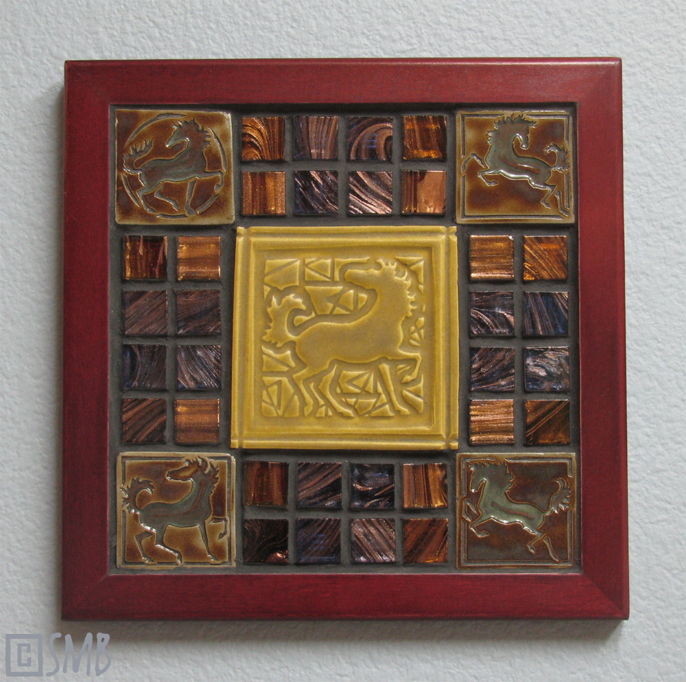
One of the new ways my ceramic tiles are making their ways to new homes...in mosaics!

After my doctorprescribed three week "pasture rest," I got back to work in earnest, getting knuckle deep in mud once again. I was particularly eager to finalize the various new applications for my tiles and get them up on Etsy pronto. At the top of that list were mosaics, an art form I'd long admired and which my handmade tiles were perfectly suited. Just like with beads, mosaics married mud and glass together with splendiferous results!

So the opening photo (above) is one of three large 9.5" x 9.5" mosaic pieces I put together, and here are the other two...

 
All three sold in the blink of an eye, something I really didn't expect. I thought they'd sit for months! It was so cool to put these pieces together, choosing just the right components and oozing the grout into the spaces. Forget spatulas or clothsfor me fingers are the best grouting tools! squish squish squish

I must admit that trepidation creeps in when I put new ideas up for sale only because I'm not so sure folks will think they're cool, too. Because I have to also admit that my various creative excursions can be quite random such as, for example, the new Shadow Horses...

On top is a pressing of my Welsh Cob (Section D) sculpture, Dafydd. The middle is from my RESS basrelief piece. On the bottom are two separate pieces pressed onto one slab, those being Imp and Vixen respectively.
Also offered are sets of "undressed" pieces for the buyer to festoon as they wish. I encourage folks to dress 'em up themselves and resell those finished pieces. It's even been suggested they'd make super pendants for necklaces. So true! It's fun when we get to "play together," and when you do, please send along pix so I can feature your pieces on the blog! And some of these showcased Shadow Horses are still available.

These "cameo" pieces were created by pressing my selected sculptures into a slab of clay using a "squish n' roll" technique. How you squish n' roll influences the profile and manifestation of the details, making each one unique. Then the pieces are bisque fired and then glazed, with the glaze being strategically wiped off the high points to make the details "pop." And into the mature fire they go. It's a meticulous, timeintensive process, but the results are really cool. I especially like how the glaze accents the reversal of the sculpture to produce a unique kind of basrelief.

But the curious thing about this project was that certain sculptures really lent themselves to this approach while others totally faceplanted, and for reasons I can't really explain. Totally counterintuitive reasons, really. But it was sure fun finding out who was squishable and who wasn't! As expected though, only the transparent, glassy glazes worked for this project since the more opaque glazes totally obliterated the detail.

Now I'd really like to try some oxides with this idea along with making molds from some of these "negatives" to give me "positives." There are lots of uses for the positives, especially for a certain new series I'm currently designing. As a hint, I have a deep fascination for ruins that feature horses in basrelief (like the Elgin Marbles) and I want to pursue that idea in earnest now that I'm getting a handle on tile pressing and free sculpting stoneware and porcelain. Lots of ideas brewing for that. In fact, if they don't explode in Big Al, the first offerings along those lines, featuring the Shadow Horse effect, may be available soon in the store.

Anyway, I offered quite a few Shadow Horses in this current Etsy cornucopia and waited in bated breath because they're so, well...weird. Boy, was I happy to find that many of you appreciate weirdness, too! But I'm not sure these critters will become a regular item in the store because they simply consume too much time to make. They're really better suited for periodic romps when the mood strikes.

As for the name, I decided to call them Shadow Horses rather than "cameos" only because I liked the idea of them being the "shadows" of the originals. Like antimatter. Like ghosts. Considering it further, it would be fun to try this technique with the entire body of one of my sculptures, which I somewhat attempted with this piece. And I gotta sayI can't wait to see how Dante squishes!

Another random addition to this first 2012 offering were these fun magnet grab bags, made from impressions of my various works in midfire porcelain. Most of them were made for use as glaze test chips, but I got the idea for magnet sets midstride and so invested more time to make them presentable after they served their purpose.

 
Some are still available!

While lots of fun to make though, they ended up eating more time than expected only because the ruboff glazing technique takes so much work (and I'm so darned picky). It eats up lots of glaze, too, and on top of that, between the touchy clay and the even touchier glazes, I lost about 50% of what I actually made. So I'm not sure if this idea will be revisited anytime soon. Test chips perhaps are best left as throwaways. Though there is the idea for mosaics. Hmmmm....

Onward! Another debut was a new shape: a circle! Adding spice to the mix, unique flourishes were pressed into the clay by hand, along the border between the edge of the square stamp and the edge of the circle. That was a blast! It was such a hoot to grab everyday objects to see what kinds of effects they'd produce.

 
Here's a new circle porcelain piece still available in "the festoonery."

New, too, were the porcelain coaster sets I offered. This one got snapped up quickly.

This coaster set is still available. The results are hardearned, lemme tell ya. The loss rate during production is alarmingbetween the mid–fire porcelain and the eventual glaze effects, I lost one for every one I made. But I think I know why, so I'm hoping the loss rate on my next batch won't be so outrageous.

The almighty circle also made its way into mosaics such as this piece here, which is still available. It showcases a rather rare stamp design, the "draft horse" version of one of my Dancing Horse stamps. I liked how the black frame set off the tile so well, so I intentionally chose dark mosaic bits to let the tile shine.

Overall, I really ended up liking the circle shape a lot. It has good "palm feel" and reminds me of a medallion or medal. Of course with that came a blinding influx of new ideas, but as per my new motto, "manageable bites," I instead made notes for next year.

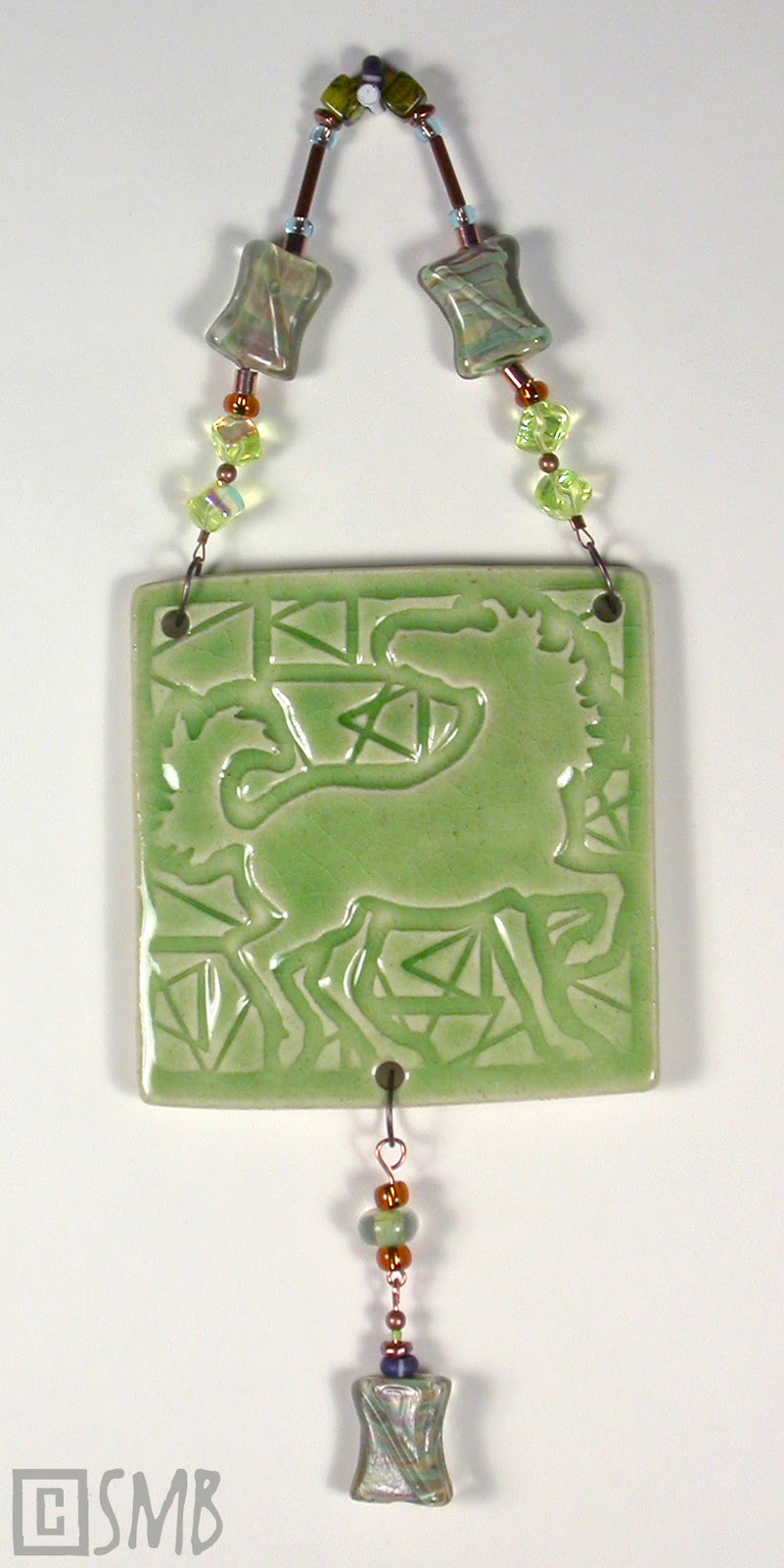
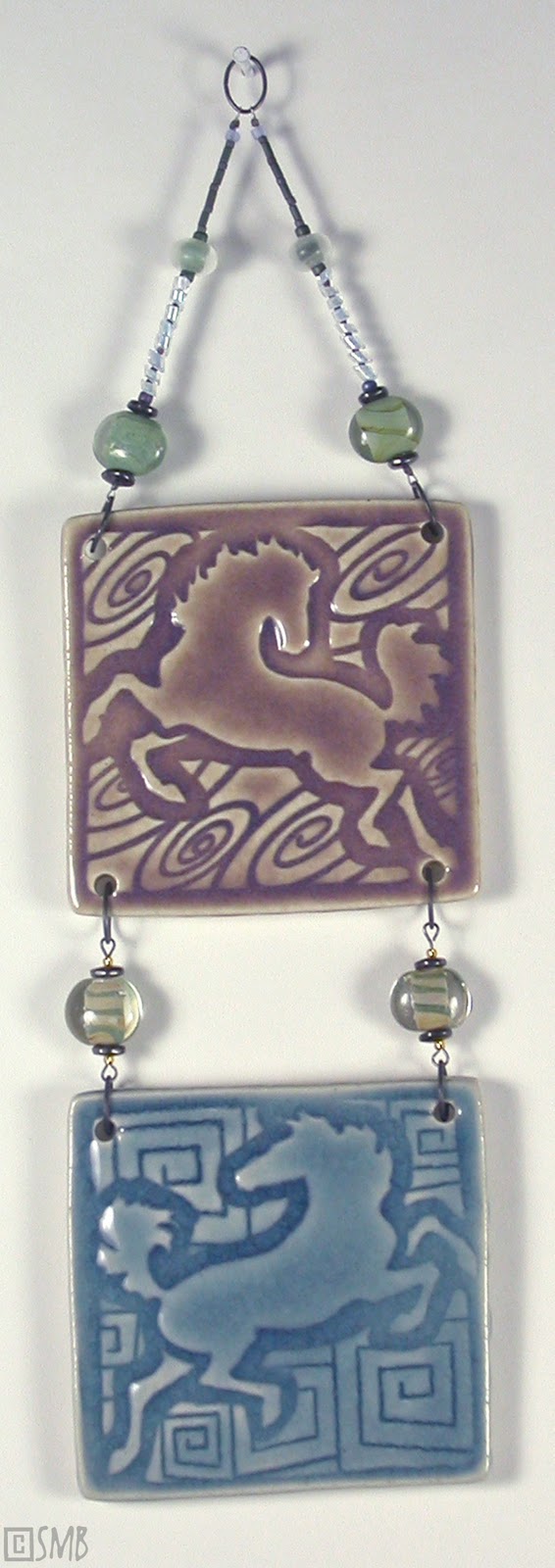
Also new were various framing schemes for these new pieces, such as these... 


The top two pieces are sold, but the handsome bottom piece is still available.

What may not be readily apparent in these framed pieces is that these are 3" stamps adapted into 4" tiles. For far too long (than I care to admit), I anguished over how to achieve this result quickly and easily since nearly all tile accoutrements are made for 4" tiles. But it was imperative to maintain the smaller 3" measurement to keep the Dancing Horses (and pieces like them) affordable as single pieces. 

All that extra space along the edges tormented me for what seemed like ages, and I spent quite a bit of mental energy cogitating elaborate workarounds. Somehow I had to avoid duplicating all those stamps in the larger 4" size because not only would that have been prohibitively expensive, but would also eat into the precious studio space that's becoming a rapidly diminishing resource around here. 

So in typical Minkie Modus Operandi fashion (of "just do it and figure it out later"), I blindly dove in when I finally got my 4" tile cutter. It was the staring at flats full of 4" squares imprinted with my 3" stamps that did the mental trick, and the solutions instantly popped into my head. As natural as breathing. So natural, in fact, that I'm still sorely irritated at myself for overthinking the problem!

What's more, the natural solutions are infinitely more flexible and interesting than any of my conceived workarounds! Blarg. Durhay Sarah! Can you be any more stupid? No wait! Don't answer that! Anyway, it's good to know that all tile accessories are now within grasp, in an easy, affordable and adaptable way.

Anyway, back to the Etsy store...also offered were new designs, such as this piece...

The new Solar Stallion in stoneware in "Rust," offered as a small colorway edition of twelve.

The glaze for these twelve pieces is actually an iron oxide applied and then rubbed offa lot of rubbing off. So while I love the rustic touchy–feely finish, the process is the kicker. See, the glazing method is tedious enough, but mix that with a rather irksome glaze and, well...let's just say this finish won't be put into production. The problem is that the oxide tends to smear and restain rather than just go the heck away, meaning that these twelve pieces took a lot of work!

The complement to this piece, the Moon Mare, has been delayed since her design needed retooling and thus a new stamp made. But stay tuned! She'll be available later this year. [It should be noted that these pieces were originally designed for my Runehorse line, but took on a life of their own and inspired an entirely new series. So the "Rune Horse" stamp on the back of these current Solar Stallions will be a bit of a novelty very soon.]

Another unique item in this sale is a festooned Dancing Horse in porcelain, with a brand new hole figuration of one hole on the top and two on the bottom...

This particular piece is a reverse impression of the actual stamp, taken from the matrix board provided by the stamp manufacturer. If you notice, this is the old "head down" version of the current "head up" version now in production. This piece turned out so gorgeous, I'm sorely tempted to keep it! It's still available...for now.

But not to be outdone, lots of regular items pepper the store shelves, from the Dancing Horse singles to all sorts of festooned pieces. Also back are the popular Prancing Pony magnet sets, such as this one...

The fourpiece Prancing Pony magnet set, "Summer Camp," which is still available

To shake it up, I included some porcelain Prancing Ponies to experiment with the medium in this manner. After all was said and done, however, I decided that porcelain is better suited to limited offerings rather than regular production. Stoneware it is then, and the new fancy stoneware clay I recently got is beckoning!

So this weekend I'll be getting the sold items packed up to ship off to their new homes as well as finishing up a couple of side projects. I'll also get back to those promised porcelain basreliefs (scheduled for sale in about two weeks) and continue with the CBCM Reflectives.

Exploring the mosaic theme further, I'm considering incorporating some of those basreliefs and perhaps a CBCM "Reffy" or two into mosaics as well. Then I'll redirect my attention to getting Dante underway and completing new sculptures for 2012, including some clay originals. Very excited! I can't wait!

So as needed as that pasture rest was, I'll tell ya whatit's great to be back up and running again. Back to the good ol' blessed routine. The creative habit. Now the wiser, this addiction is a good thing made even better with a more reasonable pace and less complications. Purpose. Simplicity. Clarity. Serenity. It feels fantastic. Hello, world! I'm back!

"Be regular and orderly in your life, that you may be violent and original in your work." ~ Clive Barker

Share/Bookmark

Friday, December 2, 2011

Dirt, Sand and Metal


 Detail of Petals and Ponies, one of the festooned Dancing HorseTM tiles still available in my Etsy store.

I believe all art is about the elementsthe elemental state of nature, the elemental sentience of existence, the elemental essence residing in all life, and the elemental ties that bind us together. The inner core. The base ingredients. Art is about life itself.

This is one of the reasons why working in ceramics is so appealing. What can be more elemental than dirt, water and fire? Mix it with imagination, dedication and passion and we rouse what is elemental within us. Art is forged in the gut. It's good for the soul.

Along with its elemental simplicity, clay also represents an ever fascinating, dichotomous blend of lowtech and hitech, serendipity and mastery, partnership and submission, function and art, timelessness and regeneration, of old and new. Ceramics evolve, yet remain true to its base elements.  

I believe the the same can be said for the work of any dedicated artist, no matter what type of art they create. Indeed, it's a philosophy I apply to all my work, and just as much to my giftware.

This fourpiece Prancing PoniesTM set, River n' Rock, was one of the many popular magnet sets offered. Each one is about 2x2" and based on a shape of either a circle or square. New upcoming designs will incorporate the triangle and oval to make the whole collection synch with the Dancing HorsesTM. Next time I may festoon these little guys, too. Tiny tiles + tiny beads = big fun!

Speaking of which, it was a madhouse here these past two weeks with beading, packaging, photographing and uploading. Why? Well, for Fuchsia Freakday, of course! Last Friday I opened my Etsy store for a big ceramic giftware sale, featuring my Dancing HorseTM tiles and Prancing PoniesTM magnets.

Offered was the usual undressed Dancing HorseTM tile, this one being AC-1 ("AC" meaning "Artist Choice"). This was my favorite tile from the entire fire, using an oxide that was rubbed off to reveal the design. I was very tempted to keep it.

In particular, there were some unique features about this sale that one could regard as landmark. For starters, this was the first time I offered my Dancing HorsesTM festooned with beadery. Mud and glass together at last! I've been a lifelong worshipper of glass beads. Hey, they're wearable bits of art glass! I've collected quite a gleaming mass over the years, like some sort of devout Bowerbird, especially during my PMC workshop last year at Shipwreck Beads

So it was a thrill to finally combine two loves into one shiny pile of giddiness. Learning how to make my own glass beads is actually on my fiveyear "to do" list so I can incorporate them into my giftware and (future) jewelry. My friends Jonathan and Joy sell their gorgeous handcrafted beads and beaded creations on Etsyhow cool is that?! With inspiration like that, who can resist?

Also new to this sale was the offering of undressed tiles with different hole configurations, this one having three holes. Collectors are encouraged to festoon their undressed tiles in their own special way and different configurations provide more options for their creativity.

Another landmark feature was a predetermined store "opening," a specific date and time when it would be instantaneously stocked and opened for shopping. Based on the rather stressful situation with my previous porcelain sale, this time around I wanted to hide my items until they were all uploaded, then "unhide" them at the appointed time to open the store. Many thanks go to Amanda for her astute instruction on how to do that, and it worked like a charm! It was a far more pleasant experience for both shoppers and myself. Thanks tons Amanda!

Still, I'm not exactly a deadline kinda artist. I'm much more free and fluid and free-flowing and...and...oh heck...OK, I'm prone to distraction. From too many ideas and too many ongoing projects. I've become a reallife Jeremy Hilary Boob

But I can say this: having an opening deadline wasn't only really exciting, it was a healthy exercise in time management. Or to put it more accurately: it was a mad rush! Midnight oil was burned by the barrel and early morning coffee was chugged by the potful. Sometimes ya gotta bust yer artistic gut to clean out the creative gears!

Another landmark aspect of Fuchsia Freakday was the debut of the Prancing PoniesTM magnets. I really love a cool, unusual, handcrafted magnet as my decorator crab-like fridge, metal shelves, and file cabinets testify. They're a delirious blend of function and art in a tiny package, and they're a super means to test new glazes to boot. So I was tickled to see the huge response to themthey were snapped up like acorns by a rampaging squirrel army! The sets were particularly popular, so that tells me I'm on the right track.

After all the hard work and preparation then, I'm delighted to report that the sale was a wild success! Thank you! It was so successful, in fact, that I plan to make Fuchsia Freakday an annual event to coincide with Black Friday. Next year, I'm even going to incorporate an exclusive, dayspecific item! Spice it up a little. There are still some items available, and being handcrafted, unique pieces of art, they make novel gifts and stocking-stuffers for the discriminating horse lover.

 
Here's one of the two-hole festooned pieces, Whirligig. Not only is it fun to come up with beading patterns, but titles, too! And this glaze is one of my very favorites - consistent, easy to apply, pools well and has a rich, smokey lavender color. If you look closely, it also creates a 3D effect with the swirls. So cool!

I'll be actively expanding my giftware items in 2012, introducing new designs, new lines and new items (including jewelry and mosaics). So amid the ongoing chaos from porcelain ornament production, I'm also finalizing loads more stamp and tilepressing designs, along with creating more basreliefs. Like I saidJeremy Hilary Boob.

A Cool Cocktail, one of the three-hole festooned pieces off to a new home.

The thing is, though, many of these new tile designs were actually done last year. Well, at least the equine figures were. That's the easy part. It's the logistical production part that's hard. For instance, what will be the flourish or theme? How will the designs work together but stand alone, too? Will I use a stamp or tile press? That's a pivotal decision because it predetermines the design, production and nature of the final piece. Then what size? What shape? What clay? What will be the target price point and how will production be designed to meet that? Lastly, and perhaps most importantly, how will all this limit or expand various other applications of the design? It may not seem like it, but this process is actually tremendously difficult.

 
Here's one of the four-hole festooned pieces, Dancing in my Dreams. This piece is still available!

Interestingly enough, though, creating the pieces for Fuchsia Freakday clarified design issues and resolved production problems in roundabout ways, so all those previously stalled designs are now flowing smoothly. At last! Blarg! I can't tell you how good it feels to finally have forward motion on them!

All that Glitters demonstrates that the fun can be doubled when tiles are festooned together!

There's also nothing like a firsttime sale of new pieces to teach you humility. Leading up to the big day, I had all my ducks in a row...or so I thought. All the boxes, promo flyers, listing methods and verbiage, packaging...yada yada yada. All was at the ready! Go me!

I soon discovered that no amount of prep can prepare for the actual play of events. In the scramble to jump through my own selfmade loopholes, for example, I was forced to make many a return trip to my local box supplier, each time thinking, "OK, I have everything I need nowI'm all set!" Aaaaaand each time returning for something I never imagined I would need, with Mike (the owner) quipping, "You forgot something again didn't you!"

It doesn't stop there! We can add more! Here's Bouquet.
   
Now some of you have asked how I come up with my ideas and, well, going back to the elementals, they're born from an alchemy of imagination and spirit, with a bit of whimsy and style thrown in for good measure. But, essentially, the bottom line is this: What kind of horsey gift would I want to give or receive? From that perspective, coming up with ideas is really quite easy. When we create from the heart, isn't anything?

 
Finding a rich, pretty golden yellow Cone 5 glaze that also pools well has been quite a quest, but I finally found one! Here's The Bright Side, one of the four-hole festooned pieces that sold on Fuchsia Freakday.

But giftware designs are also guided by specific goals necessary to create a coherent line. I put quite a bit of thought into each one to build something cohesive, continuous and versatile; to be able to evolve, yet stay true to its core. For that reason, these ten goals guide each new design:


These "Ten Commandments" make giftware a load of challenging fun to concoct, on every creative front. I mean, not only is the process a logistical puzzle, but designing these pieces asks me to see the subject with totally new eyes.

Giftware thus opens the door for expressing the subject in so many different ways, and that keeps my body of work fresher while becoming an addiction of perpetual inspiration that pulls from multiple outlets, not just realism. All this congeals into a positive feedback loop that informs the rest of my work in ways not possible by other means.

I'm Finally Warm, in response not only to the color of this piece, but to the space heater now residing in my office. It's still available in my store!

Just as importantly, giftware spreads the accessibility of my art while also revealing a side of me otherwise not so obvious. So while my sculpture work is a dialogue between me and the subject, my giftware is a dialogue that includes the collector, tooand that's a really cool conversation!

Here's the grand-daddy of them all - a "four up," Rosemary & Thyme, inspired by the wonderful British series I was watching at the time. 

I can also say that Fuchsia Freakday is my rebuttal to Black Friday. I mean, geez, "Black Friday?" I get the point, but it sounds so dreary! I have such a blast creating these pieces that I figure my version needed a bit more pep. I also choose to offer handcrafted, one–of–a–kind pieces made right here in the good ol' U.S. of A. with heirloom methods, in contrast to the typical items shoveled out by the crateful on Black Friday. And you don't even have to park your car!

The Dance, my favorite of the festooned pieces, and one of my most favorite things I've ever created. I held it back from the sale, at first tempted to keep it, but then realized it needed to live with a certain someone special I had in mind.

So all in all, this sale has been a joy, a reaffirmation, and a learning experience. Speaking through an elemental language is gratifying in more ways than one. It's a blessing that teaches new lessons and inspires new ideas, permeating the studio with the wisdom of core ideals to invigorate and reawaken. Yeah, I'll be busy next year. Just the way I like it.

"Ad hoc, ad loc and quid pro quo. So little time—so much to know!" ~ Jeremy Hilary Boob

Share/Bookmark

Thursday, September 15, 2011

Border Wars


 "Look Ma! I'm jumpin' outside the lines!" 
(a snippet of a Jax plaque)

It's against my nature to do what I'm told. Something deep down makes me rebel against boundaries, being told what I can and can't do. I don't know...maybe it's because I prefer to do things my own way, or it could be that I want to win my own triumphs and make my own mistakes on my own terms. Doesn't mean I can't take orders if I'm inspired to follow, but most of the time I dance to my own drum. Then again it could be that, as my husband lovingly observes, I'm just a brat. 

But being a brat isn't always compatible with art, especially when it comes to standardized formats. If you're familiar with my previous bas-relief work it's clear I don't like to sculpt "inside the lines." To me the boundaries of the edging shape are meant to be toyed with playfully, being a suggestion rather than the rule. This not only results in a better design, but it opens up design possibilities otherwise unattainable. So if a wisp of mane, twitch of an ear or a flick of a fetlock need to pop out more -- no problemo! Just do it.

But this idea cannot be applied to tile cutters. These things are designed in specific, industry-standard shapes and used to cut the clay slab into pre-sized portions for tile pressing, just like a giant, spring-loaded cookie cutter. 

Here are some of my trusty tile cutters to give you an idea of what I mean by "cookie cutter." While they're worth their weight in gold in terms of handiness, they do force a limitation on design. The trick is to interpret the limitation as a positive -- because in the long-run, it is.

Now I could sidestep this issue altogether and slip-cast everything, but the problem is time. Tile pressing is faster and less labor intensive whereas slip-casting requires quite a bit of baby-sitting and delay during the casting process, plus the cleaning up of mold seams. If I want to keep my gift ware affordable and keep the process easy enough to maintain inventory (and evidently the ease of tile pressing is a challenge even with that this year), I'm forced to rip down the time required to finish a single item. The less time my hands are on it, the more affordable I can make it and the more of them I can make, but that cannot be achieved with slip-casting when I'm the only one doing all the steps.

I think this is the #1 mistake artists make when trying to make a living at art: they don't understand that their time is everything. It's all they have. Every moment of every day is an essential building block to success, and no amount of talent, drive, or business savvy can compensate for misused time. The moment an artist doesn't treat her time like a finite resource is the moment she's out of business. Making a living at art isn't only a passion -- it's a discipline.

What this also means is that thinking beyond the boundaries of a project is beneficial more often than not. Many years back, I took a workshop with Veryl Goodnight (with my buddy Lynn, a trusty workshop-mate), an artist I greatly admire. In her gentle shrewdness Veryl conveyed to us lessons perhaps more important than those imparted about sculpting, one of them being: maximize your time use. You spent time, skill and energy creating that one piece -- so is that where it stops? No! Rethink, reuse, reapply! Whatever other application that piece can be adapted to is in your best interest. It can get your work into more hands, it can open up new opportunities and partnerships, and it can ensure greater financial gain to allow you to continue to create art for a living.

All these years later I still remember this smart sense and have begun applying it to my gift ware and collectibles in earnest. By maximizing the possibilities for a single bas-relief or stamped tile design, I'm essentially maxing out every minute and iota of energy I put into creating it in the first place. I'm literally completing multiple pieces at once. 

So...back to bas-relief and boundaries. The rub with tile cutters is their fixed shapes which don't allow for all those fun pointy-out bits outside the "parent shape." Rubbing salt into the wound, installations and all tile accoutrements are manufactured along those standard shapes so unless I want to spend a mint on commissioning custom-made tile accessories (with an accompanying lofty retail price), I'm stuck with the limited dimensions of the cutters. Like a stinging game of dodgeball, I have to stay inside the circle...or square, or rectangle. Oh snap!

 
 Here's my Feral Mare medallion in cold-painted resin (top), my Reflective plaque in glazed slip-cast earthenware (middle), and one of my new CubequinesTM in original oil clay (bottom). These pieces demonstrate what I mean by "sculpting outside the lines" with design portions that pop out beyond the oval, circle or square, respectively.

This reality makes me chomp on the bit like a snarfly pony. Poofy-haired and pudgey and oh-so irritated. It's also immensely difficult design-wise. For me to create a design that plays nice within the lines can take almost twice as long as one that doesn't simply because I don't have the cheat of busting through the boundary.

This border war may not seem like a big deal, but when it comes to bas-relief or stamp design, it's pivotal. What makes this art form so intriguing is its unique blend of sculpture and flatwork. It's basically a 3D painting. As such, it's best approached as a painting (for bas-relief) or graphic design (for a stamp) rather than as a sculpture.

So actively employing concepts about composition, positive or negative space, narrative and line so fundamental to flatwork really help. Indeed, they can make or break a piece. No amount of technical finesse, popularity of subject matter, or novelty of an idea can make up for compositional errors, just like with flatwork. In short, a horse head on a flat background with lots of empty space isn't the way to approach it. Bas-relief isn't about the subject, it's about the design.

And when it comes to the design, the outer border, or shape, determines what you can and can't do with the piece in future applications; it dictates the versatility of the piece and mandates production methods. So if I want to invest my time most efficiently, which is imperative with this kind of work, I need to create a shape that has the most potential, able to be applied to all kinds of casting and projects. In other words: I have to do what I'm told -- I gotta sculpt within the lines. Argh! Leave it to clay to put me in my place. 

The reason I bring this up now is because of two new Unicorn bas-relief tiles I'm working on, a matched pair with a moon and sun motif...

Here's the first incarnation of the moon design (very roughed out), with all the sticky-outy parts so typical of my approach. I really liked this draft. A lot. Then Veryl's words rang in my head. I realized this design would force me away from tile pressing, the very thing that was my primary intention for this set. I had to bite the bullet and redo it to fit into the 4.5" circle dictated by my circle tile cutter.

Voila. Here's the retweaked design (still very roughed out). I wanted to make the Unicorn as large as possible while avoiding "kissed" borders or gobs of empty space. The way I got around that was to add another circle, in this case a border, to let me poke parts out while still remaining inside the parent circle. So I got to lob some teaser shells at the boundary while still playing nice. "Does this bug you? I'm not touching you!" And, ultimately, this is a stronger design and far more versatile. I figure the Unicorn has universal appeal, so it would be unwise to limit its potential simply because of design.

Over the course of the next few weeks, I'll document the completion of these two designs in oil clay as well as their pressed ceramic production, plus how I adapt them to different projects. Along with stoneware and earthenware, me thinks porcelain is a definite must. But they're also destined for resin casting and perhaps metal later on. Most of all, I've got my eye keenly fixed Glasclay. Can you imagine these in glass?! Swoon! And all thanks to embracing boundaries.

Now all this doesn't mean that I'll be creating bas-reliefs only in these standards shapes from now on. Only selected ones. I have a workaround for the odd balls, and one I'm quite excited about. But I'll leave that for a future blog post when I actually implement it. The beauty of this workaround though is that it allows me to adapt any shape to any standard tile accessory, but since it requires an investment of more time, resources and energy at the back end of production, it's ideal only for specialty items. Anyway...back to the work bench!

"And this is one of the major questions of our lives: how we keep boundaries, what permission we have to cross boundaries, and how we do so." ~ A.B. Yehoshua

Share/Bookmark

Monday, January 3, 2011

Glazed Over and Giddy

A test on my new Pacem in Terris ornament.

I have an intermindable obsession with art glaze. It stems from my passion for art glass because art glaze literally is glass you apply to bisque. So as you might expect, the glassier and more luminous the art glaze, the more intense my fixation. 

Even better, art glaze offers infinite effects being so mercurial and situation specific. For instance, different methods of application or even different conditions within the kiln can result in totally unexpected results, many unique and gorgeous. This keeps me from getting bored since I never really know what Big Al will cough up until he opens his maw. Whether a fabulous new piece or confounding disappointment, glaze does its own thing regardless of my best intentions, and that's what keeps it interesting! Altogether, I can honestly say that my favorite part of working with mud really is the chance to play with this magical substance and to experiment with new types or combinations that keep boredom at bay.

So here are some excursions with some of my new glazes; all of them are mid-fire glazes, Cone 5  or Cone 6:

 Laguna WC-132 Analin Green on one of my new Prancing Ponies 2 x 2" magnets. This is a very temperamental glaze that can be wildly different depending on how it's applied. In order to get its full affect, like seen here, it has to be applied alarmingly thick. But that also means that the design needs very sharp, defined edges otherwise it'll get overwhelmed and lost. Those little white flecks aren't dust, they're sparkles in the deep crackled recess of the horse!
 
 
 Georgies GLW19-Moss Thicket applied to another of my Prancing Ponies magnets. Absolutely gorgeous! Again, sharp, defined edges are essential. I applied this glaze as instructed in the directions, but I'm curious to see how it behaves with new applications. I've learned never to make assumptions about what to expect with art glaze -- you just never know until you tweak it!

Mayco SW-100 Blue Surf applied to another one of my Prancing Ponies magnets. Again, another beautiful glaze! Like the previous two, you can see that the design needs to be crisp and literal, something I'm learning that brings out the best in many art glazes. I also want to try different applications of this glaze because who knows what treasures it'll produce if applied differently.
 
Now these two (and the Pacem test at the top of this post) are the result of a typical practice here -- attempting to tweak glaze with a high fire crackle glaze. Despite glaze's unpredictability, I've found that one (almost) constant is that crackle glaze can add dimension to any glaze, or fix just about any unwanted result. Curious to see how it would react, I applied Laguna WC-137 Skye Crackle onto already-fired Mayco SW-103 Sisal on that top piece. I love the result! But what you can't see in the image are all the sparkly effects that deeply pooled crackle glaze creates inside the horse. Like stars on a clear night! Now the bottom piece is that same crackle glaze applied onto already-fired Mayco SW-108 Green Tea. I thought the Green Tea would work awesome with my designs, but alas...it did anything but! However, I love the intense color produced by its combination with the crackle, and though you cannot see it in the photo, it has a deep 3D dimension to it. It's hypnotic. As for the Pacem test at the top of this post, that was the same crackle applied over already-fired Coyote MBG-106 Sunshine Yellow as an experiment -- and I love it! Glorious and glassy!

 
Again, Laguna WC-137 Skye Crackle comes to the rescue on two more Prancing Ponies magnets! The top piece is the crackle on Mayco SW-108 Green Tea again, but look how different it is! The bottom piece is the crackle on that diva-esque Laguna WC-132 Analin Green, and those "rustic" edges are really appealing.

Now here are illustrations of the benefits of using Readystamps, with both the stamp and the stamp's matrix available to provide the "positive" and "negative" versions of the same design...

My new Runicorn design (the first in the series), a 4" circle, with the stamp version (yellow) and the matrix version (purple). In this case, both versions work equally well, though I do favor the original stamp version more. However, it'll be fun to see how each one reacts with different glazes. The yellow glaze is Georgies GLW33 Crystal Topaz and the purple glaze is Georgies PG640 Lavender Lupin - I love them both!

Here we have a new Rune Horse design with the original stamp version on the left and the reversed matrix version on the right. Both of them work really well, which is an unexpected bonus! The glaze is Georgies GLW33 Crystal Topaz, and it's gorgeous. I refer to this piece as a "Solar Stallion" and it's a 2 x 4" ornament or tile.

 And here's the complementary piece, the "Moon Mare," with the original version on the left and the matrix version on the right. Again, both versions work equally well. However, here's where a "sweet spot" showed up: The stars need to be bigger, and that star on the top should be lowered to avoid the hole. Consequently, this design has been retooled and will be resubmitted to Readystamps, with this version being discontinued. The glaze is Laguna WC-138 Twilight Blue, one of my very favorite glazes, especially when it's watered down and the tile is dipped face down, creating all those lovely marbled color variations. I actually liked how these two turned out so much that I decided to pull them out of the Rune Horse line and create their own, Elementals, so I could explore this theme further. However, these here (and those that will be offered in my Etsy shop soon) are stamped on the back as Rune Horses, something that ends with this batch! Regardless, the matte glaze of the stallion doesn't match the glossy glaze of the mare, so I need to find a glossy yellow for the stallion and a matte purply blue for the mare. I figure why not run both a glossy and matte version of the same designs? The more the merrier!

Again, here's Laguna WC-137 Skye Crackle fixing Mayco SW-108 Green Tea, but this time on one of my new 3 x 3" Dancing Horse tiles. Again, you can't see the 3D effects this combination produces, and I think I may put it into production -- I like it so much! So here's a great lesson: If you don't like a glaze, experiment to discover how it combines with others because, chances are, it may be something really awesome when paired with a "buddy"!

If you remember my comment from my previous post about a great idea: "Mix up the 'innies and outies' within a series," here's what I meant by that. Originally all the Dancing Horse tiles were designed like the one on the bottom, with the horse being an "outie" (the primary reason being the effect discussed next). However, thanks to the Readystamps matrix, I was able to create a reverse version in which the horse became an "innie," like the one on the top. I realized my new option: To mix up the versions in the series! Why stick with one interpretation when the design and glaze work well either way? Speaking of which, the glaze is Laguna MS-56 Hyacinth, a glaze I've been meaning to try for sometime -- and it turned out absolutely gorgeous! Better than I could have hoped! It's a wonderful smokey purple with a lot of depth and warmth that breaks and pools beautifully! It also creates a 3D effect (especially on the top tile), which always gets a big thumbs up from me! A design is only as good as its glaze and the glaze is only as good as its design: The two are symbiotic.

Now the interesting thing is this: I originally did a reverse version of the original design (above) through my old stamp maker, using the "Invert" option in Photoshop, which makes all black areas white and all white areas black thereby changing which sticks out (white) and which protrudes in (black). But instead of reversed innies and outies, the result was a "draft horse" version (below).

 I have to figure out why this happened because this definitely wasn't the result when I used the reversed matrix version from Readystamp! I suspect it may be because different methods were used by the two different companies to make the stamps. This suggests that Readystamps provides options within the original design whereas ABC Stamp provides options based on "draft horse" versions of those designs. Good to know!

Speaking of different versions, I retooled my first Runedeer design for production. The original version (left) is about 2.5 x 6" which is a lovely shape, but not standardized to my clay cutters. It also is slip cast, which takes too long for production. So I retooled the concept to fit into a 2 x 4" space (right). But while the stamp works great, Laguna WC-132 Analin Green refused to behave! Out of the 64 Runedeer I stamped, only seven made it through with glaze as anything near sellable! And only one came out the way I wanted it to, the one pictured above. I need to find a more agreeable glaze for this kind of complex design, which will be one of my big treasure hunts this year because I want to expand the Runedeer line for Christmas and create more similarly complicated designs.

Likewise, I discovered that detailed, more realistic designs don't work so well with stamping. In fact, they work so poorly (in comparison to the drawing), I may not repeat this idea and leave such things for decals. However, I'm going to retool this design to see if that helps because I so love glaze and the touchy-feely aspect of stamped clay! This is the first in my Unicorn series, with the original stamp design on the left and the reversed matrix version on the right. In my opinion, the reversed version definitely doesn't work (good to know), so that one will be the only one to exist. As for the glaze on both, it's Georgies PG640 Lavender Lupin again.

So now back to my Pacem in Terris design (which means "Peace on Earth" in Latin). This piece presented a series of unexpected challenges because it blends a more realistically rendered horse within a "graphic" idea, like one of those old magazine illustrations. I thought it would be a simple translation into clay, but I realized quickly that such a concept has a series of distinct "sweet spots" as does any glaze applied to it! I made an imprint of its matrix version (not pictured), which came out much clearer and crisper -- but since the matrix is made of a stiff material and a rubber stamp is softer, I have to run a test stamp through Readystamps again to see if a rubber version of that reversal will work as well (and I couldn't use the matrix version because it reversed the words). But I see now where I need to tweak the design, which I'll be doing this week for next year's Holiday season (which means this first version will be retired immediately and the copies I created in December will be the only existing pieces). Then I ran into glaze issues with it. I initially ran half in Georgies PG640 Lavender Lupin and half in Coyote MBG-106 Sunshine Yellow. The Lavender came out nice (even though it was a light coat), but the Sunshine Yellow -- while pretty -- was too flat, and failed to pick up the details of the design. So I coated them (after they'd been glazed) with a color I thought would add punch, Coyote MBG-099 Sedona Sunset (a gorgeous red). Some I gave one coat (middle) and some I gave a heavy coat (bottom). The results were lovely, though I'd like to find a "one fire" process for next year. I actually tried mixing the two glazes together while wet, but all I ended up with was an unpleasant fleshy, salmon color.


I often run wild experiments, taking flawed pieces that seem hopeless and seeing if I can salvage them (or learn a new glaze combo) with an unexpected combination with another glaze. Every so often, these experiments produce pieces so lovely I cannot bear to throw them out, no matter how warped or hosed up they are...and these pieces are the latest "butterfly births." What you can't see in these images (again) is the hypnotic 3D depth many of them have, or the sparkly "twinkle" effects caused by the crackle glaze, or all the stunning varied colors crammed into all the little nooks and crannies. I have no idea what I'll do with them, but they're keepers! And yes -- I did learn some enticing combinations I hope to duplicate in the next batch of tiles! All of these are variations on Laguna WC-132 Analin Green (the rejects from the Runedeer run), illustrating just how much variation a glaze can produce with little changes.

Variety doesn't just come with glazes, however. It can come with clay! And above are the only existing copies of the Solar Stallion and the Moon Mare in porcelain, being stamped from the leftover porcelain slabs from the Joy project. Compared to the stoneware clay, the difference in feel and look the porcelain produces with the glaze is like night and day (har har). The yellow glaze is Coyote MBG-106 Sunshine Yellow and has far more depth on porcelain than on stoneware, and the purple is Georgies PG640 Lavender Lupin again. The porcelain has a "cooler," bluer tone which really changes the "temperature" of glaze colors.

Along those lines, I took four Joy ornaments that didn't quite get up to Cone 5 during the fire and decided to play with glaze on them. Initially, I gave them a very light glaze with Georgies PG640 Lavender Lupin because I thought that touch of purple would look nice on the white bisque..and it did, resulting in the piece on the left. One of those ended up a bit messed up, so I decided to add another layer to see what happened. So I applied Laguna WC-137 Skye Crackle to it and refired to Cone 5 resulting in the piece on the right. Will I glaze future editions within the series? No -- I still like the bisque version best, and I found that the thicker the glaze application, the more the tiny details get lost.

So there ya go -- another adventure in glaze-mania! I have other new glazes I haven't been able to try yet  (and more ordered and on the way), so I'll be back in the ceramic studio soon to dive into the melee again. It's a great love to discover new effects and new glazes that work well with my designs. It's like a collaboration with Nature itself! And many of these pieces will be available for sale soon in my Etsy shop, so stay tuned for the heads up!  

Now in the next blog post I'll showcase the gift packets I've put together for my different lists of wonderful customers in a "12 Days of Christmas" Minkiewicz Studios "Thank You" Gift Giveaway. Ideally I would have been able to do this before Christmas, but well...they're the products of this mad experimentation. So there are six gift packs featuring many of the pieces shown here because part of the fun of finding new glaze treasures is sharing them!

"We shall not cease from exploration / And in the end of all our exploring / Will be to arrive where we started / And know the place for the first time." ~ T.S.Eliot

Share/Bookmark
Related Posts with Thumbnails